
Porsche Enova · EV Cockpit Experience
Rethinking Porsche's
EV Cockpit
Design Role
UX Lead
Team
UI Design Team collaborated w/ UX Strategy
Duration
Spring Quarter 10 Weeks
Tools
Figma · Linear
Overview
As UX Lead on the UI Design team, I managed 7 junior designers while coordinating with Product and Project Managers through 50+ Linear issues. I led the UI design strategy for the Porsche Enova concept vehicle, working in close collaboration with the UX Strategy team to ensure our designs were grounded in validated research. Our cohort spanned three dedicated teams: Physical Build, UX Strategy, and UI Design.
The following points detail my specific leadership contributions:
Research Collaboration
Working alongside the UX Strategy team, I contributed to competitive teardowns, safety tests, and ride-alongs — ensuring our UI Design work was grounded in real driver pain points.
Principle Translation
I synthesized the UX Strategy team's research findings into four core design principles, bridging strategic insight and visual execution across every UI design decision.
Wireframe Creation
I oversaw wireframe production and personally iterated designs for the instrument cluster and infotainment display, translating the validated IA into screen-level UI.
Ecosystem Extension
I led my team to extend the new design language to the My Porsche app, personally iterating on designs to ensure cohesion across the full EV ecosystem.
The Challenge
What Happens When a Racing Heritage Collides With the Autonomous EV Era?
Porsche challenged us to re-imagine the digital cockpit of its next-generation EVs—preserving the brand's driver-first DNA while embracing radical leaps in autonomy, UX, and sustainability.
The challenge required cross-team collaboration to deliver a cohesive, future-ready ecosystem: a physical vehicle concept, a research-validated IA, a unified visual language for in-car displays, an adaptive interface with four driving modes, and a redesigned My Porsche app flow.
Original Porsche Ecosystem:
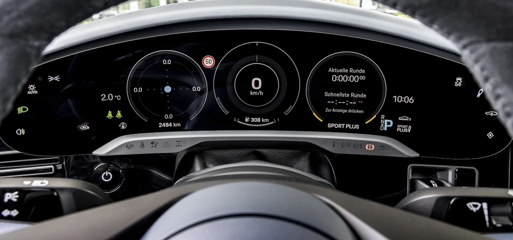
Porsche Taycan's Instrument Cluster
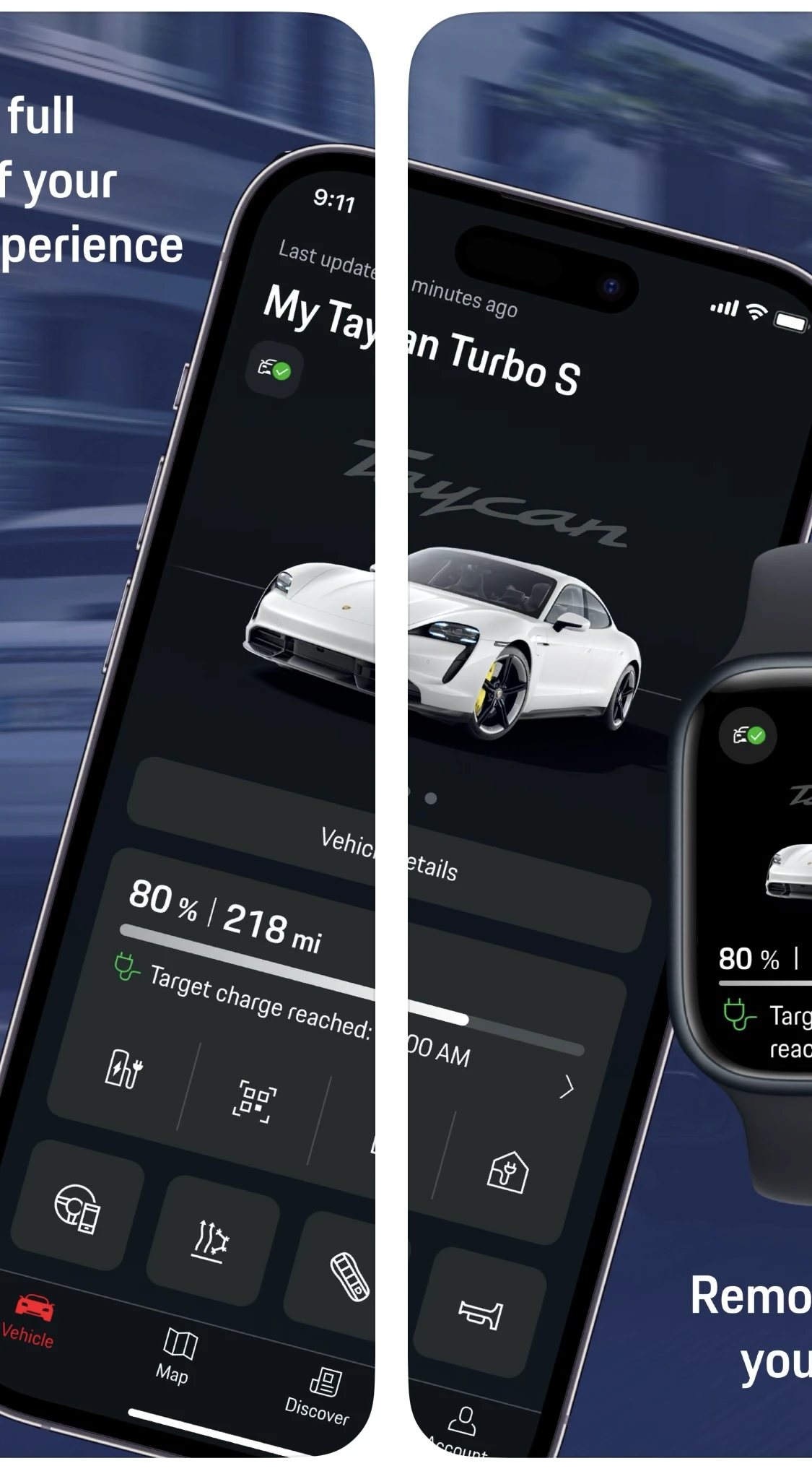
My Porsche App
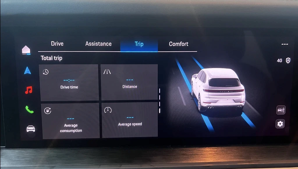
Porsche Macan 4 Electric Infotainment
Redesign the digital cockpit
Create a unified in-car interface for the instrument cluster and PCM that preserves Porsche's driver-first ethos while introducing modern EV features.
Extend to the mobile ecosystem
Redesign the My Porsche app to ensure cohesion across the full EV experience, from the cockpit to the driver's phone.
The Research
How Do Drivers—and Data—Expose an EV Cockpit's Blind Spots?
Before sketching a single wireframe, the UX Strategy team led a comprehensive research push — combining competitive analysis, user interviews, and safety testing to map exactly where the Porsche EV experience succeeded and where it fell short. My UI Design team collaborated closely throughout, ensuring research findings translated directly into our design decisions.



Design & Usability
How Can Design Turn Research Into a Glance-Safe Porsche EV Experience?
With the UX Strategy team's foundational research complete, the challenge shifted fully to execution. Building on their validated IA, I directed my UI Design team to translate research findings into wireframes for the instrument cluster and PCM. I then led the extension of our design language to the My Porsche app and validated the gains through live usability tests.
Information-Architecture Evolution
Working alongside the UX Strategy team through iterative tree testing, we transformed a confusing baseline architecture (36.4% direct hit rate) into a validated structure with dramatically improved findability (84% direct hit rate) — the foundation my UI Design team built every screen on top of.

Before

After
Wireframe Evolution
With my validated IA as the blueprint, my team designed core screen layouts under my direction.
Persistent IA Dock
Provides constant top-level access, solving the 'lost in menus' issue identified during IA validation.
Driver Home Screen
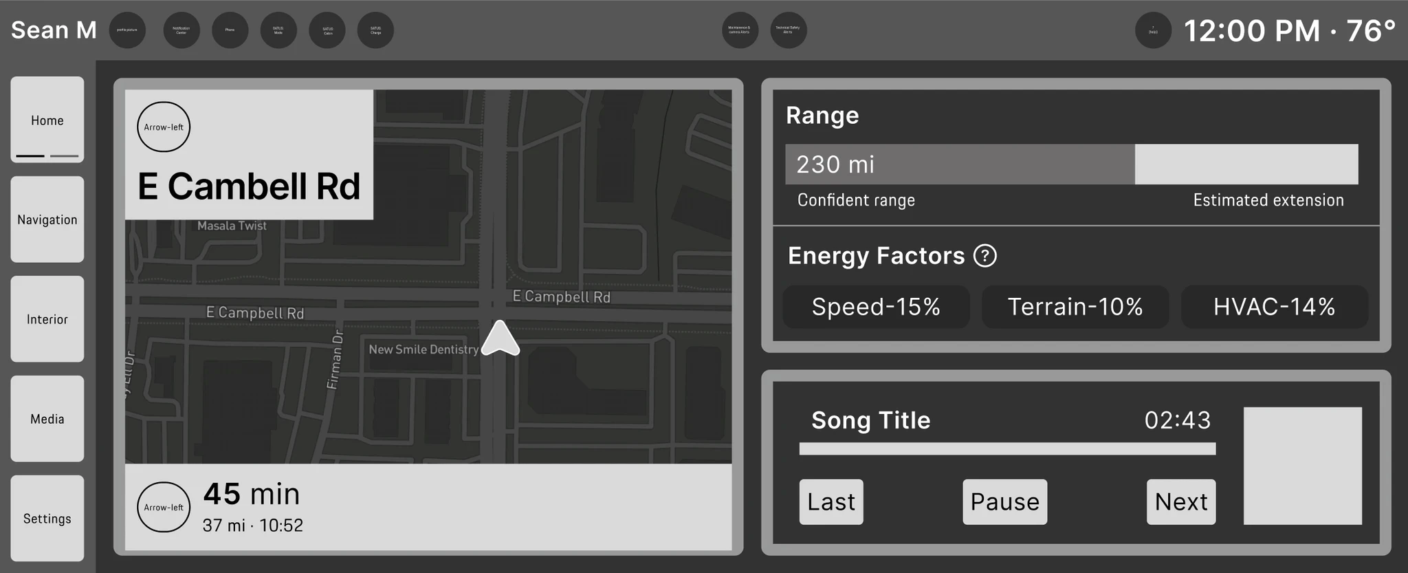
Cross-Domain Dashboard
Combats fragmentation by surfacing cross-domain data (e.g., Energy, Media) onto a single, personalized dashboard.
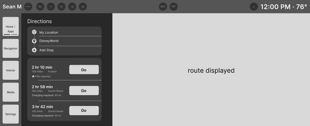
App Launcher & Main Menu
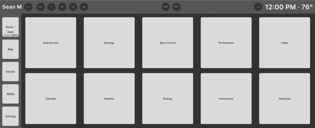
Navigation: Route Selection

Cabin: Seat Climate & Massage
Ecosystem Extension: Trip Planner Flow
Working closely with my team, I led a full redesign of the mobile Trip Planner within a tight 3-week timeline — solving the Range Anxiety pain point discovered in user research.
Trip Plan Screen Iterations:
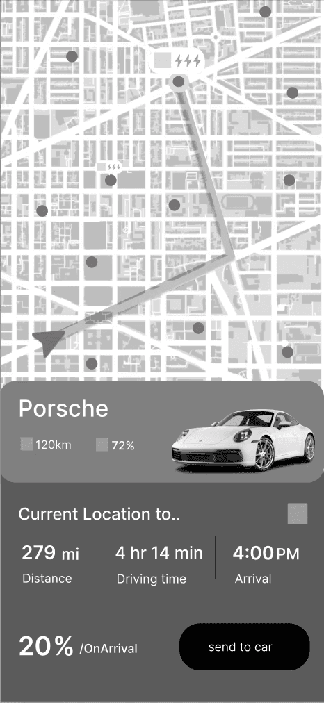
V1 — Baseline route
Static map + list card only; no battery prediction, charger help — our starting canvas.
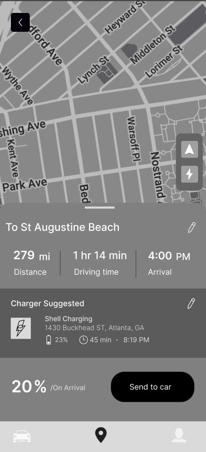
V2 — Arrival % + nav bar
Added %-on-arrival alongside distance, drive time, ETA — and a bottom nav for global access.
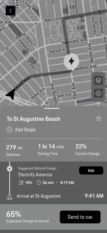
V3 — Final Trip Screen
The validated final design solving Range Anxiety end-to-end.
Range Certainty
Arrival battery shown — 65% for instant range certainty.
Anxiety Solved, Confidence Delivered
Proactively adds a necessary charging stop to the route with an updated ETA.
Expectations Aligned, Control Simplified
Nav/bolt swapped for layers + re-center to match map expectations.
Usability Testing:
I conducted two rounds of SUS testing. The Physical Build team constructed a full cockpit rig for in-person tests — recognizing a true driving experience can't be simulated on screen.
AR HUD
Instrument Cluster
Infotainment Screen

Facilitator
User
Note Taker

The final SUS scores of 86.5 and 80.8 place our design in the top tier of usability — well above the industry average of 68. This confirms our user-centered process resulted in a successful and highly usable final product.
Final Outcome
What Does a Driver-First, Future-Ready Cockpit Look Like?
The final design represents the culmination of collaborative work across all three teams. This solution blends Porsche's purist, driver-first DNA with modern EV technology — with the UX Strategy team providing the research foundation and my UI Design team translating those insights into a cohesive, fully realised interface.
Scale Score
Infotainment Screens
Our final design answers the project's central challenge by preserving Porsche's 'driver-first' DNA with a focused, glance-safe dashboard. We simultaneously embraced modern EV needs by integrating rich features like a 'Gas Equivalent' cost comparison and multi-sensory 'Ambient Modes', creating an experience that is both innovative and unmistakably Porsche.
Home Dashboard & Menu
Our cross-domain widget system provides at-a-glance status for energy and media alongside live navigation, creating a single, driver-focused dashboard.
Charging Screen
Provides at-a-glance charging data, including time remaining, session cost, and a unique 'Gas Equivalent' cost comparison to show tangible savings.
In-Cabin Atmosphere
This domain unifies all in-cabin controls — from air quality and seat massage to multi-sensory 'Ambient Modes' that sync lighting, sound, and climate into a single, curated experience.
Explore App
Screens
A Mode for Every Moment
Instrument Cluster & Infotainment Screen
Our final design is not one single interface, but an adaptive HMI that honors Porsche's 'driver-first' DNA. The digital cockpit transforms across four distinct modes, each tailoring the visual style and information hierarchy to the driver's specific intent — from a focused track day to a comfortable commute.


Beyond the Deliverables
Core Lessons from a Cockpit Redesign
Leading the UI Design team on a cross-functional redesign taught me that the most valuable insights come from managing people, processes, and pressure — not just pixels. As UX Lead coordinating 7 designers across 10 weeks while collaborating with the UX Strategy team, these lessons extend far beyond this project.
Cross-Functional Coordination at Scale
Managing 7 designers while coordinating with Product and Project Managers taught me that clear communication frameworks are essential. I established structured check-ins, streamlined issue tracking through Linear, and maintained constant alignment to keep a complex 10-week project on track.
Team Performance Under Pressure
With tight deadlines and high expectations, I learned that psychological safety drives results. By fostering a supportive environment and providing clear, actionable feedback, my team delivered quality work on time even under stress. Empathy became my most valuable leadership tool.
Strategic Leadership vs. Tactical Execution
Leading end-to-end required balancing high-level strategy with hands-on design work. I learned to delegate effectively while maintaining design quality through regular feedback cycles, ensuring my team felt empowered while meeting project standards.
Looking For More?
Check out my next featured project...
