
A More Accessible, Connected Atlanta
Improving ADID's
Wayfinding System
Design Role
UX Lead
Team
Collaborated with PM and junior designers
Duration
Winter Quarter 10 Weeks
Tools
Figma, Linear, Maze
Overview
As UX Lead, I led the design and research efforts for a 10-week collaboration with the Atlanta Downtown Improvement District (ADID) to improve the city's outdated information desk. Working within a multidisciplinary team, I guided junior designers while reporting to the Project Manager and contributed across all phases of the project — from early research and branding, to UI design, usability testing, and final delivery. I led my team to create a modern, intuitive, and accessible wayfinding experience tailored to Atlanta's diverse and growing audience, with a focus on improving usability, strengthening visual clarity, and supporting visitors as the city prepares for the upcoming World Cup.
The following points detail my specific contributions to this vision:
User Research Leadership
I conducted comprehensive surveys with 105 responses and stakeholder interviews to identify pain points and user needs for downtown Atlanta's wayfinding system.
Interface Design & Testing
I led the design of the complete kiosk interface, working with my team through iterative sketches, wireframes, and high-fidelity prototypes, validating designs through physical and digital usability testing.
Design System Creation
Working with junior designers, we built a comprehensive design system from scratch, including signals, paths, and systems components, with complete documentation for developer handoff.
Team Coordination & Project Management
I guided junior designers through design iterations and coordinated project delivery milestones with the Project Manager to ensure timely completion.
The Problem
What Happens When an Outdated System Meets a Growing City?
ADID (Atlanta Downtown Improvement District) tasked us with improving downtown wayfinding. The existing information desk was outdated, visually unclear, and failed to effectively guide Atlanta's diverse visitors.
To address these challenges, we delivered a modernized information desk and an intuitive digital kiosk interface designed for clarity, accessibility, and seamless integration into the urban environment.

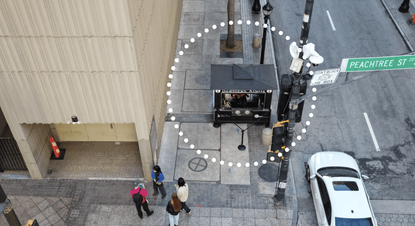
Design a digital kiosk
Creating the interface, ensuring it fits seamlessly into the environment next to the information desk.
Redesign the information desk
To create a more inviting, intuitive, and accessible experience for visitors.
Usability Challenges:
Visitors struggled to locate existing kiosks in busy downtown areas
Current interfaces lacked accessibility features for users with disabilities
Available information didn't match visitor expectations or needs
Research
How Do Visitors Really Navigate Downtown Atlanta?
To design kiosks that genuinely serve a modern city, I conducted research through surveys and interviews with commuters, visitors, and locals, uncovering real moments of need. As Atlanta prepares for the 2026 FIFA World Cup, these insights became the foundation for our design decisions.
Surveys:
What Users Currently Expect From Kiosks:
What Features Users Want in Kiosks:
Interviews:
Inside Perspectives That Shaped Our Design:
Safety Officer
We rely on our phones to look things up. It's not ideal when someone needs help fast.
Staff rely on personal phones and paper pamphlets to help visitors.
There's no mounted screen or digital tool to quickly find information during peak moments.
Stakeholder
For many visitors, this kiosk is the first thing they'll engage with. It should reflect the best of Atlanta.
Visual storytelling, multilingual support, and consistent branding were recurring themes.
The kiosk must seamlessly connect people to nearby businesses, events, and hotels.
Design & Usability
How Can Design Bridge the Gaps We Discovered?
Grounded in user research and stakeholder insight, we designed a dual solution: a reimagined information booth and a digital kiosk system that responds to real needs. Our goal was to create a wayfinding experience that feels intuitive, accessible, and alive with relevant, real-time information.
From Sketch to Screen
I conducted layout explorations moving from initial sketches through wireframes, focusing on information hierarchy and user flow optimization. These early wireframes built the foundation for an interface that gradually improved through structure, branding, and interaction. This phase set the stage for user testing and meaningful iteration.

Low-fi
Early sketches exploring layout, navigation flow, and content hierarchy.
Physical Usability Testing:
I conducted physical usability testing with 7 participants using a full-scale paper prototype, asking them to interact with the layout, rearrange UI elements, and complete tasks based on real-world scenarios.
User 1
User 2
User 3


Usability Testing on Maze:
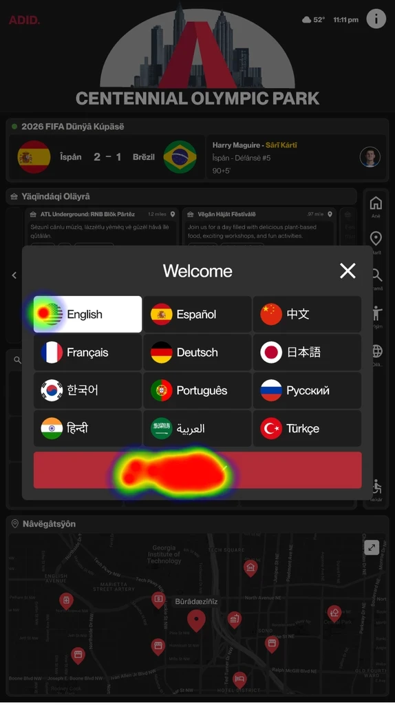
After gathering insights from physical testing, I executed testing sessions on Maze and ran three rounds of tests. Each round built on the last, helping us evaluate clarity, uncover usability issues, and refine layout and interactions.
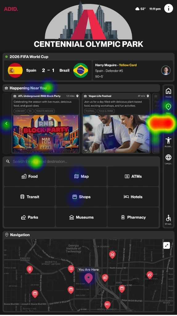
Heatmap: Home Screen
Heatmap: Selected Event Screen
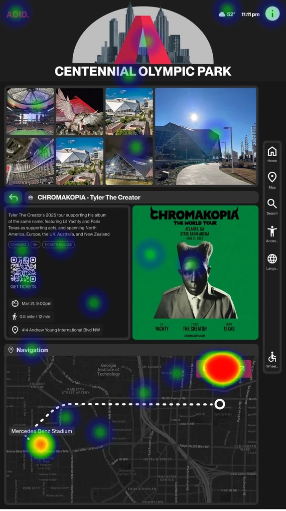
Heatmap: Transit Screen
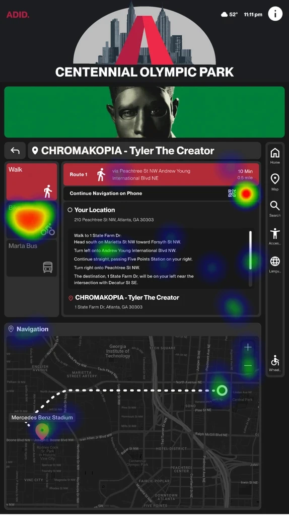
Heatmap: Language Screen
Maze Task:
Locate a concert
84.6% of 26 users located the concert using either the nav bar search or the on-screen search bar, confirming that multiple entry points support quick discovery.
Maze Task:
Switch the kiosk language to English
88.1% misclick rate on the original language icon indicated confusion. Replacing it with a more recognizable symbol boosted success rates — clear visuals are vital for language toggles.
Maze Task:
Get directions to the concert
20 out of 26 users consistently found the 'Get Directions' option, indicating a layout that effectively guides visitors to the next step without confusion.
Maze Task:
Locate all available navigation routes
Users easily located navigation options through intuitive icons. However, 10 users noted small images and unclear labels caused confusion, highlighting a need for better visual hierarchy.
Maze testing revealed specific usability issues. We made targeted adjustments by improving language toggles, clarifying icon meaning, and refining layout hierarchy to support smoother user flows. One significant change was shifting the navigation bar from the right to the left, which aligned better with natural hand placement and eye-scanning behavior, leading to improved icon discoverability and fewer missed clicks across core tasks.
Final Outcome
What Does an Inclusive, City-Ready Solution Look Like?
After months of research, design, and iteration, we delivered a comprehensive wayfinding solution that achieved measurable improvements in user experience. The redesigned kiosk interface earned a System Usability Scale score of 74.30, while usability testing showed significant reductions in task completion time and navigation errors compared to the existing system.
Scale Score
Transit & Map
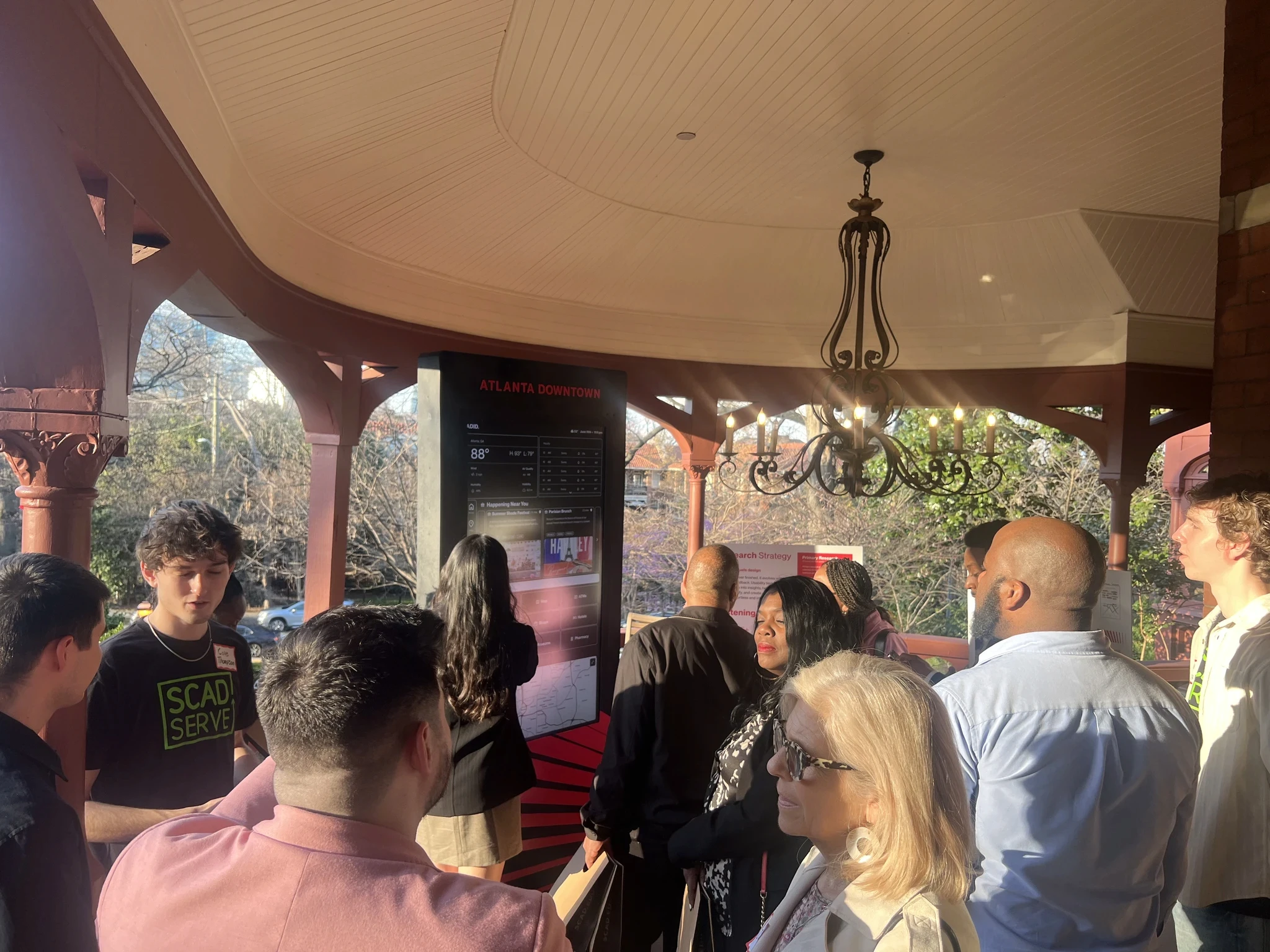
Built for speed and clarity, this screen simplifies city navigation with live maps, key transit icons, and intuitive directions.
Home & Accessibility
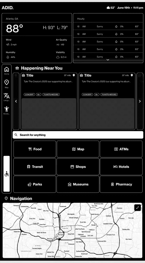
Quick access to key destinations, live updates, and events. Built-in accessibility options like font sizing and wheelchair mode support inclusive use.
Design System
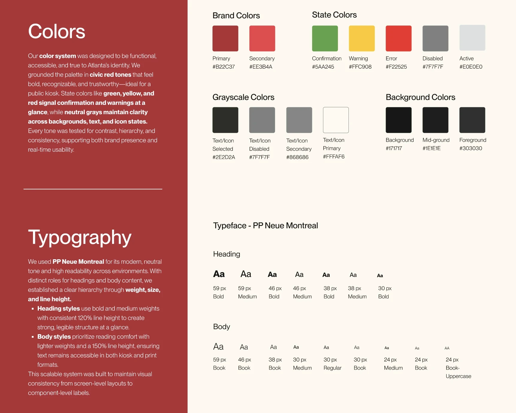
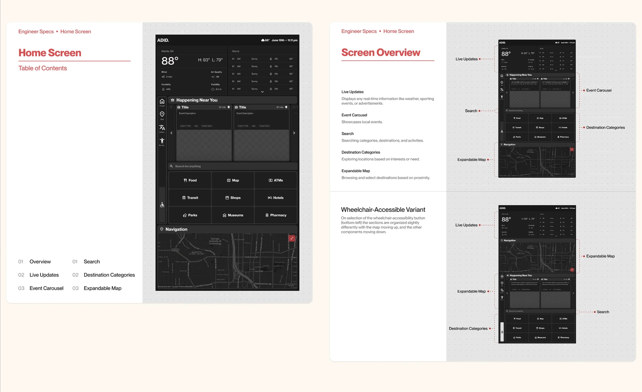
To support a consistent, accessible, and future-ready experience, we created a design system tailored for the kiosk and information desk. This system brought structure to our components, clarity to our visuals, and flexibility for developer handoff. Inspired by real-world wayfinding, it was designed not just to look good, but to guide users and grow with the city.
I grounded our system in a simple metaphor — Signals, Paths, and Systems — reflecting how urban wayfinding works. Each layer helps users navigate, understand, and move through the interface with ease.
Check out the full Figma File: ADID Design System



Information Desk
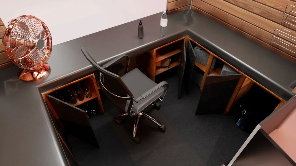
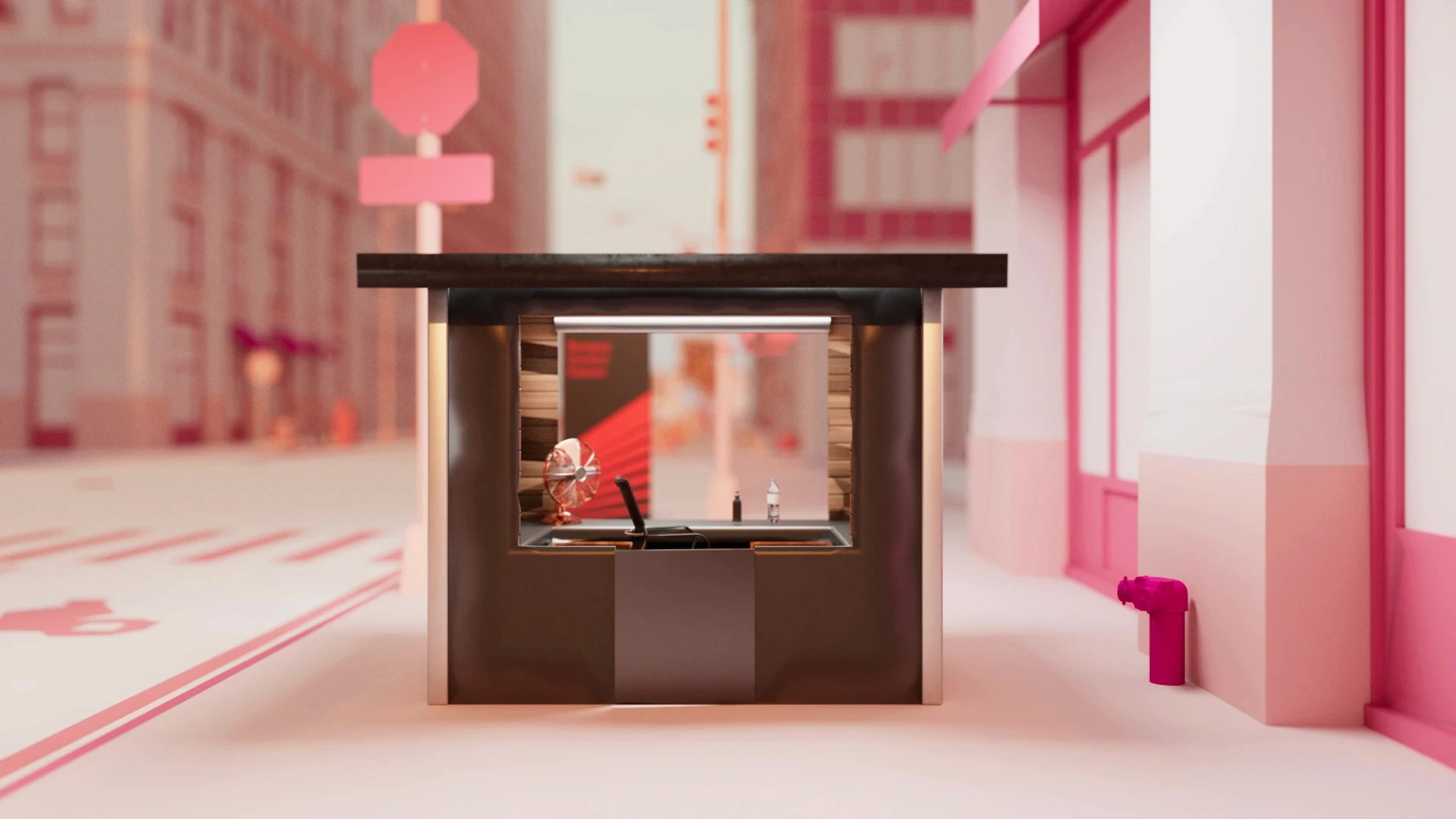
Redesigned to be approachable and practical, the new information desk features a modern layout, expanded storage, and improved visibility. Built with both staff and visitors in mind, the structure adheres to accessibility guidelines and height standards, ensuring ease of use for all. This design brings clarity, comfort, and inclusivity to the heart of downtown wayfinding.
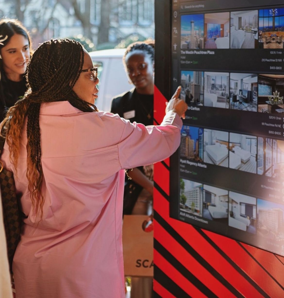
Bringing It To Life!

Beyond the Interface
Core Lessons from Public Wayfinding Design
As UX Lead, collaborating with stakeholders across city government, accessibility advocates, and maintenance teams while designing for Atlanta's diverse population revealed critical lessons about inclusive design that extend far beyond this project. The takeaways below reflect what I learned about designing for public infrastructure, managing constraints under pressure, and advocating for users within complex organizational systems.
Stakeholder-Centered Design at Scale
Balancing user needs with operational realities in civic projects taught me that successful public design requires diplomatic navigation of competing priorities. I learned to advocate for user-centered decisions while building consensus among city officials, safety personnel, and technical teams.
Inclusive Design as Systems Thinking
Designing for Atlanta's diverse population showed me that accessibility compliance is just the baseline — true inclusion requires systematic consideration of language barriers, digital literacy levels, and physical constraints without compromising core functionality.
Constraint-Driven Innovation vs. User Advocacy
Working within hardware limitations and budget constraints taught me to balance practical realities with user-centered principles. I developed skills in knowing when to push back on technical limitations and when to find creative solutions that satisfy both user needs and operational requirements.
Looking For More?
Check out my next featured project...
